Truth Social App Logo Branding Mistake: What Branding Lessons Can We Get from It?
Truth Social launched with a bold branding push, eager to stake its claim as the next big player in the social media space. But the moment their new logo went live, the spotlight shifted from the platform to the plagiarism debate.
Observers quickly pointed out a striking resemblance between the Truth Social logo and that of Trailar, a UK company specializing in solar tech for transport fleets. Publications like Business Insider and CreativeBloq jumped on the story.
And Trailar? They didn’t just notice—they considered legal action.
The internet reacted swiftly. Branding experts, designers, and everyday users alike lit up social platforms with criticism. The conversation wasn’t just about design aesthetics—it was about brand integrity. How does a high-stakes launch overlook something so fundamental?
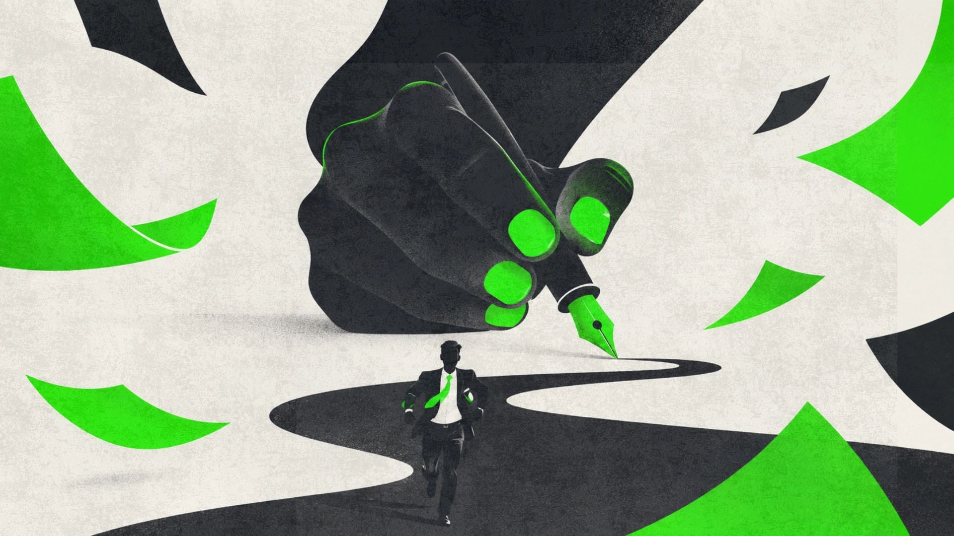
The backlash wasn’t just embarrassing—it was avoidable. And it served as a very public reminder: in branding, originality isn’t optional—it’s your credibility.
This controversy wasn’t just a logo mishap. It was a branding case study in missed diligence. And for any company—emerging or established—it underscored a critical truth: protecting your visual identity starts with doing the work. Because once brand trust is questioned, recovery is uphill.
The Problem: Visual Similarity and Reputational Fallout

When Truth Social launched in 2022 under Trump Media & Technology Group (TMTG), it aimed to disrupt the social media landscape. But almost immediately, the spotlight turned—not on innovation, but on imitation.
The app’s logo—a fragmented “T” set against a blue background—bore a striking resemblance to the branding of Trailar, a UK-based company specialising in solar solutions for commercial transport.
The internet didn’t miss it.
Neither did Trailar.
Their marketing head publicly confirmed they were seeking legal advice. Side-by-side comparisons left little room for debate.
This wasn’t just a design coincidence—it was a branding landmine. In the eyes of consumers and courts alike, visual overlap can create confusion, dilute identity, and invite legal action. Trailar feared exactly that: being mistakenly associated with an unrelated—and highly political—platform.
And they had a point.
Trademark law exists to prevent this kind of brand confusion. In fact, the U.S. Patent and Trademark Office later rejected Truth Social’s trademark application, citing lack of distinctiveness and potential conflict with existing marks.
The fallout came fast. Media outlets ran with the story. Social platforms lit up with criticism. For a brand still finding its footing, the damage wasn’t just visual—it was reputational. In branding, perception is equity. And when originality is questioned, trust erodes.
For TMTG and the Truth Social app, what should’ve been a launch moment turned into a lesson in what happens when you skip the fundamentals.
Lesson 1: Research Is Non-Negotiable in Logo Design
When you’re designing a logo for a social platform, media brand, or even a clean-tech company like Trailar, visual research isn’t optional—it’s foundational. Before a single sketch hits the page, you need to know what’s out there.
- What shapes and colour palettes dominate the space?
- What have your competitors done right—or wrong?
A logo isn’t just a mark—it’s a message. And if that message looks like someone else’s, you’ve already lost. Research protects you from blending in—or worse, infringing.
Due diligence doesn’t stop at visuals. Trademark checks are non-negotiable. A logo that looks great but isn’t legally safe is a ticking time bomb. Smart branding means diving into global databases, understanding potential conflicts, and validating originality before you launch.
Skip this step, and you risk imitation by accident—opening the door to lawsuits, cease-and-desists, or complete rebrands. In digital industries where perception moves fast and trust is fragile, that kind of mistake can be fatal.
The stakes are real. A logo too close to someone else’s mark can trigger legal fallout, drain resources, and fracture brand trust overnight. It’s not just a legal issue—it’s a brand safety issue.
For platforms like Truth Social or companies like Trailar, the cost of oversight isn’t just monetary—it’s reputational. If you want to build a brand that scales and sustains, originality isn’t a creative flourish. It’s a business essential.
Lesson 2: Brand Equity Must Align With Visual Identity
Brand equity isn’t just about awareness—it’s about perception. It’s the value your brand adds beyond product or service. It’s loyalty, trust, emotional connection—all the intangibles that make people choose you over anyone else. And visual consistency plays a huge role in that.
Logos, colour palettes, and typography—they’re not just decoration. They’re shorthand for your brand’s personality. When visuals align with your values, you reinforce credibility. You signal trust. You become recognisable—and memorable.
But when that alignment breaks? So does the connection. A mismatched logo isn’t just a design flaw—it’s a branding red flag. Imagine a legal firm using Comic Sans or a luxury brand using clashing neon gradients. That dissonance weakens trust and confuses the audience. Inconsistency creates doubt. And doubt kills loyalty.
Take Truth Social, for example. Its visual identity didn’t just raise eyebrows—it missed the mark entirely. The platform had a clear ideological audience, but the branding felt generic, mismatched, and unrefined. The result? A disconnect between what users expected and what they experienced. That misalignment didn’t just make the app harder to trust—it made it harder to take seriously.
In branding, every visual cue is a trust signal. And trust is fragile. When your identity doesn’t reflect your values or resonate with your audience, brand equity erodes. Fast. That’s why great brands obsess over coherence. Because consistency isn’t about control—it’s about connection.
Lesson 3: Testing with Real Users Saves Reputations
A/B testing isn’t just a growth hack—it’s brand insurance. It puts decisions in the hands of the people who matter most: your users. Instead of relying on hunches or internal opinion, A/B testing lets you run side-by-side versions of pages, features, or designs—and measure what actually works.
The data speaks. The users vote. And you make smarter moves, faster.
Tech giants live by this method for a reason. It minimises risk, sharpens performance, and builds products that resonate because they’re shaped by behaviour, not bias.
But testing doesn’t start with code—it starts with listening. Tools like heatmaps, micro-surveys, or in-app prompts give you a direct line to user sentiment. That feedback forms the basis for hypotheses you can test.
Real-time insights highlight blind spots early before they escalate into public backlash. Dropbox’s early traction? Fueled by feedback loops from HackerNews users that led to a sharper landing page and clearer messaging. That kind of iterative insight is the difference between guessing and growing.
Take the Truth Social logo debacle as a case in point. The controversy over its uncanny resemblance to Trailar’s mark could’ve been avoided with a simple feedback loop. Early user testing might’ve flagged the visual similarity before the media storm hit. Instead, the brand took a reputational hit it didn’t need to. Because testing isn’t just about conversion rates—it’s about credibility.
In an age of instant opinions and infinite alternatives, listening before you launch isn’t optional—it’s strategic survival. A/B testing and real user feedback protect your product, your brand, and your reputation from errors that could’ve been caught with a click.
How We Approach Strategic Logo Design
At Illustrado, logo design isn’t just about aesthetics, it’s a strategic exercise in brand storytelling. Every mark begins with discovery. This is where we decode your brand’s DNA; its purpose, values, and ambitions. Through deep-dive workshops and key stakeholder interviews, we uncover the real narrative behind the business. Without this layer of clarity, design is just decoration. With it, every element serves a purpose. That’s how we create logos that mean something.
Next, we map the landscape. A competitive audit helps us understand where your industry is—and where the white space lies. We examine how others are showing up visually and identify the patterns, clichés, and visual noise we need to rise above.
This step isn’t about comparison; it’s about positioning. We’re not just designing to look different—we’re designing to stand apart.
Then comes iteration. Our process is agile and idea rich. We sketch. We stretch. We refine. Concepts are tested against criteria like adaptability, clarity, and emotional impact. Typography, color theory, negative space, every choice is intentional. Our iterative flow ensures that the logo doesn’t just evolve creatively—it evolves strategically.
Finally, we bring in the voices that matter. Cross-functional testing gives us a 360° view of how the logo performs across real-world applications—digital, print, product, pitch. We collect insights from stakeholders across marketing, leadership, and operations to make sure the mark reflects not just the brand’s spirit—but its scalability. Alignment is key. Confidence is the result.
Because in the end, a great logo isn’t just a design—it’s a declaration. And at Illustrado, we make sure yours says exactly what it needs to.
Avoid the Pitfalls—Audit Your Brand Identity Today
At Illustrado, logo design isn’t just about aesthetics; it’s a strategic exercise in brand storytelling. Every mark begins with discovery. This is where we decode your brand’s DNA: its purpose, values, and ambitions. Through deep-dive workshops and key stakeholder interviews, we uncover the real narrative behind the business. Without this layer of clarity, design is just decoration. With it, every element serves a purpose. That’s how we create logos that mean something.
Next, we map the landscape. A competitive audit helps us understand where your industry is—and where the white space lies. We examine how others are showing up visually and identify the patterns, clichés, and visual noise we need to rise above.
This step isn’t about comparison; it’s about positioning. We’re not just designing to look different—we’re designing to stand apart.
Then comes iteration. Our process is agile and idea rich. We sketch. We stretch. We refine. Concepts are tested against criteria like adaptability, clarity, and emotional impact. Typography, colour theory, negative space—every choice is intentional. Our iterative flow ensures that the logo doesn’t just evolve creatively—it evolves strategically.
Finally, we bring in the voices that matter. Cross-functional testing gives us a 360° view of how the logo performs across real-world applications—digital, print, product, and pitch. We collect insights from stakeholders across marketing, leadership, and operations to make sure the mark reflects not just the brand’s spirit but also its scalability. Alignment is key. Confidence is the result.
Because in the end, a great logo isn’t just a design—it’s a declaration. And at Illustrado, we make sure yours says exactly what it needs to.
Ready to evolve? Book a discovery session with Illustrado – branding agency in Dubai and see what’s possible for your business. In a discovery session, you’ll talk about your brand, your goals, and what you want to achieve.
FAQs
The Truth Social logo branding mistake was that its design looked very similar to Trailar’s logo. This caused confusion and criticism because it seemed like the logo was copied instead of being original and unique.
To avoid copying another brand by accident, do a thorough search and competitive audit before designing your logo. Check existing logos in your industry and make sure your design is different and unique to clearly promote your brand.
Using a logo that looks too much like another company’s can lead to legal problems like trademark infringement. This can cause costly lawsuits, force you to change your logo, and damage your brand’s reputation.
Brand equity is important because a strong logo helps build customer trust and loyalty. A well-designed logo increases the brand’s value and makes people more likely to choose your brand over competitors.
A/B testing helps by showing different logo options to real people and seeing which one they like best. This feedback makes sure the final logo connects well with your audience and supports your brand message.
Illustrado’s logo design process is different because it focuses on understanding your brand’s DNA first, then carefully plans and tests designs with stakeholders. This strategic approach creates logos that truly reflect your brand and build strong connections with customers.